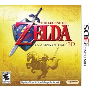
The Legend of Zelda: Ocarina of Time was a classic practically the instant it was released, and it still holds up as a fun adventure today. It's been repeatedly re-released over the years, but its port to the 3DS handheld brings some substantial new changes, including ones that don't involve a third dimension. It features the Master Quest from the Gamecube version, which changes up the dungeons and has to be unlocked by completing the original game, and has various tweaks and additions that either improve the gameplay slightly or give a little more help to people who need it.
If you somehow haven't played the game before, it set a lot of standards for 3D action adventure games. It has a targeting system that lets you keep an enemy in your sights no matter where you go, it features a meaningful day and night cycle that affects your options at a given time, and it brought the concept of dangerous, puzzle-filled dungeons into a more modern era in a way a lot of games still copy. It had a couple small flaws though, flaws that this remake weren't afraid to address. The dual-screen set up makes checking the map and your equipped items a lot quicker, and the map now has more useful waypoints for side activities. Boots are now considered items instead of gear, making switching them on and off in places like the Water Temple a lot simpler, and you now have five item slots instead of three, including one that's dedicated to your always-useful ocarina. A couple of the slots require using the touch screen, but it's a worthwhile trade-off. You can also look or aim weapons in first person by physically moving the 3DS, which makes things that require it easier, especially if you're sitting in a rotating chair. Another addition is a new kind of statue that you can find and use to view video hints for various puzzles that might be sticking points for people who aren't already intimately familiar with the game. I sort of missed the rumble in certain spots, but at least they found away around that issue with the stone of agony.
The audio sounded pretty much exactly the same to me, but visually the game is a nice upgrade from the original version, even if you ignore the 3D effect (which I enjoyed, except for a couple moments where objects were very close to the screen). It may seem to look the same as it used to, but if you actually compare them, this port is a lot sharper and nicer looking. It basically looks the way your rosy memories of the original game are telling you it looked. Some objects are redesigned to take advantage of the hardware, and lots of things, especially characters' faces, are just a bit nicer to look at. When you combine the better aesthetics with the small gameplay improvements, I have a hard time picturing myself wanting to play Ocarina of Time again in the future and not picking this version. I wouldn't exactly call it definitive, because for some people sitting on a sofa in front of a TV will always beat staring at a tiny screen embedded in a less-than perfectly ergonomic handheld. But it's hard not to love a technically superior, portable version of one of the best games ever made.
AAAAAGGGHHHH
16 years ago


No comments:
Post a Comment