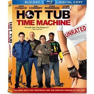
You've probably seen a movie like Hot Tub Time Machine before. A comedy that you like the actors in, and has a funny concept, and is actually pretty humorous, but you still feel a little let down by. It's not a bad movie at all - I'd call it pretty good. But I kind of wish it was more. This is a movie about a group of guys who find a hot tub that can travel back in time... and they spend the whole thing stuck in the 80s. A common complaint with comedies is that all the funny parts are in the trailer, and while that's not really true here, I'd like to make a variation on the idea. There are plenty of laughs that are not in the trailer, but all the laughs that are in the trailer are represented in full. What might have been teases for great scenes, like the one with Craig Robinson reluctantly having sex in the bath, are pretty much exactly as they appeared, with nothing extra you didn't know about. It leads to a movie that's funny but not really ever unexpected.
It's obvious after a point that it's really a send up of 80s movies rather than time travel. A few stars of those films appear, like Chevy Chase as the mysterious hot tub repairman and Crispin Glover as a bellhop who's always close to losing an arm. And it's really a typical 80s comedy in a lot of ways, with characters like Lizzy Caplan's Deschanel-esque quirky perfect girl and Sebastian Stan's douche bag alpha male. There's a lot of gross-out bodily function stuff that doesn't really play anymore and of course a Communist paranoia thread that helps lead to the main conflict keeping the good guys from getting back to the present. All of the main guys are pretty good, and the supporting cast is mostly decent even if some of them didn't really sell the 80s so much as someone's vague memories of the 80s. Rob Corddry is the main comedic catalyst, though honestly it seems like he's trying too hard in an attempt at a broader audience. I liked the movie, I just wish it was better. And after hearing about the whole color correction issue, it was impossible not to notice. If you don't know what I'm talking about, google "teal and orange". Lots of movies are limiting themselves to this palette, and it really doesn't work in a movie that's supposed to represent the 80s. It just looks really weird in spots. Even the DVD box art can't escape the madness.
AAAAAGGGHHHH
16 years ago


No comments:
Post a Comment